You may have heard about architectural elements that work and don’t work when thinking about how to redesign your healthcare clinic. There have been some recent developments in medical interior design that take into account the psychological effects of colour and the benefits of an open floor plan. However, there are more considerations to make before starting your interior design project than you might think. Here are some of them:
- Integrated technology
- Biophilic designs
- Adaptable spaces
The Psychological Impact of a Space on Its Patients
The aesthetic choices you make can significantly affect the impression that patients leave with of your medical practice. Making patients feel at ease and safe is a top priority when it comes to design for health clinics. Customers who have a positive experience are more likely to return, so it’s important to think about how minor design elements might affect your business’s bottom line.
Consider the Concept of Colour
Colors of white and blue are not typically associated with the healthcare sector. This may not be the best tone to set in many contexts, but it is especially inappropriate in patient waiting areas or meeting spaces like the reception or onsite.
Further, it shows how contrasting colours, such as an accent wall against an otherwise neutral backdrop, can be used as an alternative means of directional cueing (to differentiate areas of your clinic from one another).
The physical environment also has a significant impact on patients’ states of mind. Open floor plans that let in lots of natural light and breezes are all the rage in today’s buildings. Visitors will feel more at ease if there is more natural light and less clutter. It’s all about being creative with flexible layouts; an open layout doesn’t have to mean fewer seats for patients or a reduction in essential operations.
Here are three key ideas to keep in mind for great healthcare clinic design, which will help you create a workplace perfectly suited to your brand and patients.
Focus on Adaptable Spaces

Moving furniture and other fixtures around is becoming increasingly popular in the field of medical interior design. In patient waiting rooms in particular, giving visitors the option to rearrange furniture to suit their needs makes everyone feel more at ease.
The addition of movable walls enhances this sense of mastery and gives patients more freedom to arrange the room in a way that best suits their needs. One possible scenario is a family waiting together and deciding to rearrange their seats so that they are closer together. Those waiting alone who value tranquility can make the necessary adjustments to the area.
The same flexibility applies to the layout of treatment areas. The clinic will be better able to adapt to fluctuating numbers of patients if consultation rooms can be expanded or partitioned as needed by medical staff.
Consider flexibility in your design so that these areas can serve as temporary consultation rooms, private waiting areas, or extra office space for staff as needed.
Spaces designated as waiting areas must be flexible enough to meet the requirements of various patients
Employ Biophilic Designs

Simply put, the goal of biophilic design is to create an environment that makes people feel as though they are in the natural world even when they are inside.
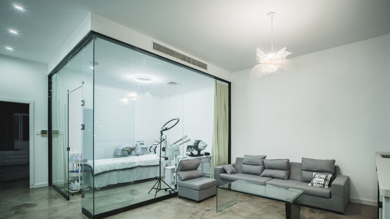
Patients will feel more at ease and the clinic will have a more open feel if natural elements are incorporated into the design. A simple first step is to install more windows, glass curtain walls, and skylights to let in more natural light for patient care and staff productivity.
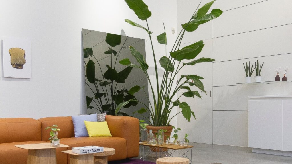
Your patients will feel at ease and have a more positive outlook if they are surrounded by natural elements like water features and plants. In addition, adding plants to your interior design will boost oxygen levels, which can help you unwind.
Using earthy paint tones or changing the colour of lighting from “cold” white to “warmer” yellow can be good alternatives to adding green spaces or extending windows. Fake plants can help you create the illusion of a natural setting and move closer to creating a biophilic design.
Incorporate Technology Into Building Designs
The applications of medical technology should evolve as the field develops. Kiosks for digital check-in and patient surveys are two potential additions to a remodelled clinic.
The patient check-in process is streamlined, and patients have better, more immediate access to information, thanks to digital kiosks. The need for a large check-in office desk that stands between customers and employees is mitigated when such machines are incorporated into waiting or reception areas. If you add patient seating to your remodelled waiting area, you won’t have to sacrifice productivity in serving your customers. Patients can get help or view their own medical records at a digital kiosk without having to bother your staff.
Patient feedback can be collected more frequently and directly with the help of survey stations, which can either be built into check-in kiosks or placed in a separate location
By incorporating them into patients’ outgoing processes, you can collect a wealth of information and persuade customers to disclose details they might feel awkward disclosing to your staff in person.
Conclusion
Creating a design brief is the first step in completing a successful clinic redesign. Key goals for the building can be outlined in this document, along with the floor plan, aesthetic, and other design elements that will get you there.
Still, many hospitals and clinics either skip this step or continue on with only a vague idea of where they should go next. While inspiration can strike at any time, jumping into a redesign without a clear goal in mind will almost certainly cause you to blow your budget and schedule.
